- Date added 19. 11. 2024

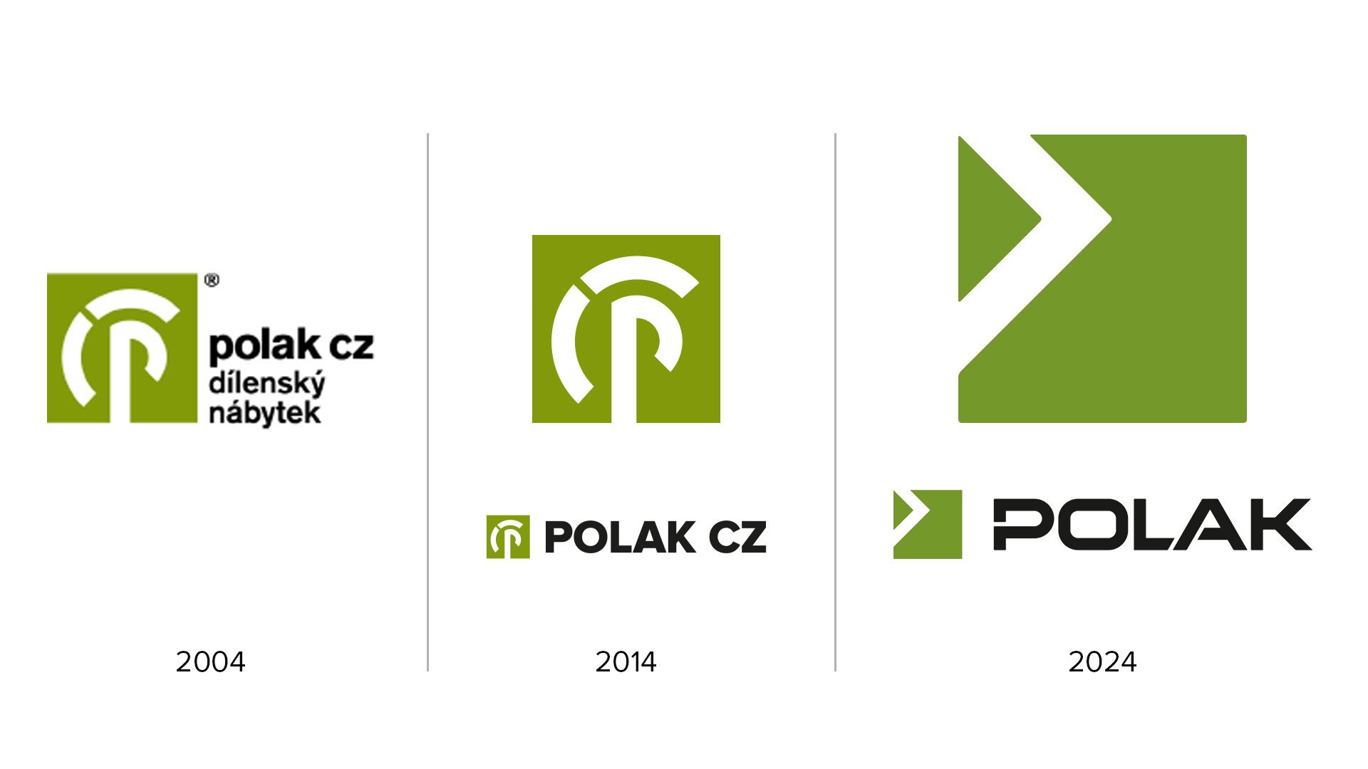
POLAK CZ presents new logo: a symbol of modernisation and dynamism
We are evolving and growing... all of us. We are maturing. At the moment, we as a company have also reached the stage of important visual changes that will be part of our products in the coming years. Everything has clear shapes and contours and we think it's the right time to finally share it with you - we are happy (and proud) to announce a significant change in our visual identity.
After ten years, it's time for a logo refresh that reflects the evolution of our products, values and goals. The new logo, which we will begin using on December 1, 2024, is the result of careful collaboration with graphic designer and illustrator Martin Sodomka.
Why did we decide to change?
The logo is an important element that represents our brand and communicates with the outside world. Over time, the existing one started to seem less suitable for modern marketing. The common goal was to create a visual that better matched the character of the company, while making it easier to promote the company in the B2B and end market.
And that, dare I say, we succeeded.
What changes does the new logo bring?
The logo change is in three main areas:
What does the logo change mean for you - our customers?
The new logo is more than just a visual change. It reflects our commitment to providing modern, quality and precision products, whether it's metal workshop furniture or prefabricated halls. We believe this fresh wind in our sails will help us communicate our vision even better and take us one step closer to new and existing customers.
We thank you for your long term support and look forward to the next new chapter.


By sending the form, you express your consent with the storage of personal data in accordance with the provisions of § 5, paragraph 2 of Act No. 101/2000 Coll., On the protection of personal data, as amended. You agree that your personal data provided by you hereby will be processed and kept in an electronic database, only for the purposes of tenders and for a maximum period of 1 year. The consent may be revoked at any time in writing or electronically.
I agree